When Supreme opened it’s doors back in Spring of 1994, streetwear was in its infancy. The independent skate store, located on Lafayette Street, was just getting started. Over the past 26 years, Supreme has grown from a cult brand into something worn by celebrities. In that time, the demographic of Supreme has changed. However, there are a few items that will always bring together the various factions of Supreme fans: one of which is the box logo.
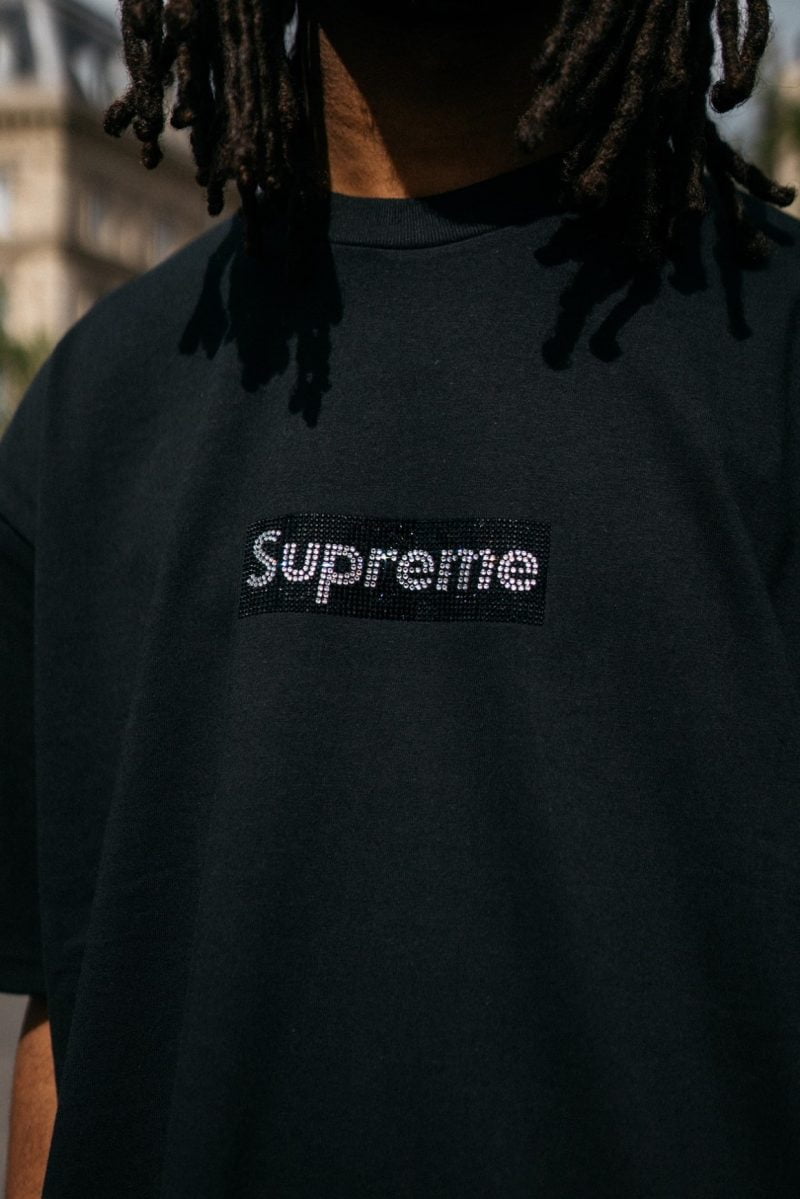
Supreme’s box logo design is one of the most instantly recognisable in the world. The classic rectangle logo is now a status symbol. As Supreme has grown, so has the hype and desire surrounding the design. Whilst Supreme’s box logo T-shirts may sell for upwards of €500+ nowadays in 1994 this wasn’t the case.
Origins
James Jebbia’s passion to open a store that perfectly encapsulated the essence of skateboarding happened in 1994. Having become close friends with Shawn Stussy and worked at hit retail stores like Union and Parachute, Jebbia has experience. After Stussy left his eponymous label, Jebbia decided it was time to launch Supreme. In an interview with GQ, Jebbia explained that “I really liked what was coming out of skate culture at the time. So I just thought, ‘OK, let’s do a skate shop'”.
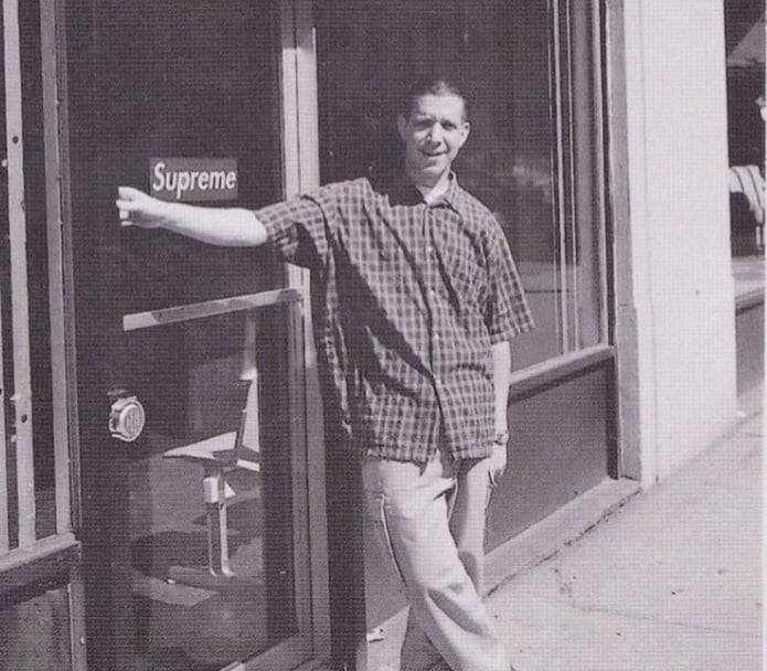
After saving $10,000, Jebbia would finally open Supreme’s doors in 1994. Whilst the store was already stocking brands like Spitfire, Shorty’s and Zoo York. However, to coincide with the launch, Jebbia wanted to launch some of Supreme’s own T-shirts. Three were designed; one with a 1970s skater, one with Travis Bickle from Martin Scorcese’s Taxi Driver and one with the shop’s logo.
When Jebbia’s friend came back with the design, he liked it but felt that it was lacking something. He lent the designer a book on the conceptual artist, Barbara Kruger. Kruger’s work features red and white colour blocking throughout and uses political messaging in her work; something that would become a staple part of Supreme’s history. There is some debate as to whether Supreme copied or took inspiration from Kruger’s work to this day.
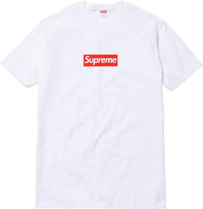
What came back to Jebbia was a red rectangle with a white Futura bold oblique font stating “Supreme”. The simplicity of the design was like nothing else in skateboarding. How big is a Supreme box logo? A calculated 4.875 inches wide by 1.75 inches high. Whilst many other skate shops wanted to make their clothing loud and garish, Supreme opted for a different approach.
The box logo T-shirt released in a select few colours, with the most popular being the white and black versions. Costing a mere $20, the shirt opted for an affordable price point that skaters could afford. When the box logo design eventually started selling out the other brands, Jebbia realised that he was on to something.
Growing Popularity
Skaters soon began rocking Supreme box logos and getting a lot of looks. The crisp white T-shirt with a red and white logo was a simple yet eye-catching design. Supreme bogos soon became an object for those in the know with New York street culture. It’s this mysticism and clever retail plan that allowed Supreme to get its name recognised.
This increasing popularity meant that Jebbia commissioned more designs. With Supreme’s first birthday fast approaching, a number of new versions had been created. A teal box logo T-shirt dropped, as well as a crewneck sweater which featured “New York” embroidered on the back of the neck. Whilst the brand was still in its infancy, it had already won over the skate rats of New York: a big step considering the attitude of their clientele.
Around the same sort of time, Supreme had begun to attract attention from Japanese tourists visiting New York. It became something of a stamp of approval when the returned home, flexing crisp box logo designs for their friends to see. It meant that Supreme was opened up to a wider audience, with many Japanese tourists wanting to get their hands on a one. By 1998, Supreme was really beginning to hit its stride.
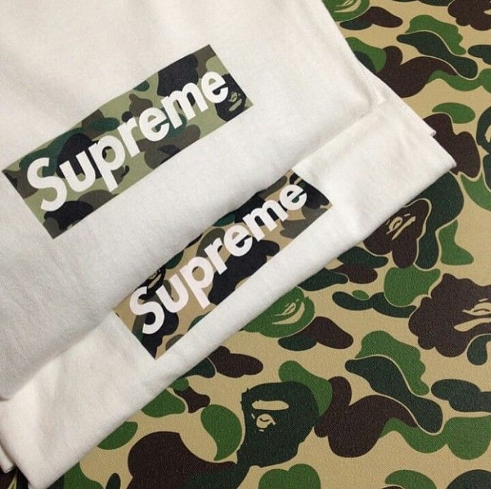
Collaborations with BAPE on 15 different coloured box logos in 1998 meant that East met West in design: sparking the first collaborative box logos ever. For Jebbia, working with Nigo of BAPE turned him onto a brand new audience. After seeing the popularity that Supreme had in Japan, though it was not accessible, it allowed Jebbia to get the Supreme brand out to an entirely new demographic and customer base.
Law Suit
As Supreme’s underground following began to grow, so did the buzz about who the brand actually was. Given the secretive nature of its wearers, Supreme had started to attract a following in the world of streetwear. In keeping with the rebellious spirit of skateboarding, Supreme began to remix popular logos of other brands. In 1997, Supreme had released a box logo with a striking similarity to Burberry. The check pattern lay underneath the white Supreme Futura font and made for a slick piece for those in the know to cop.
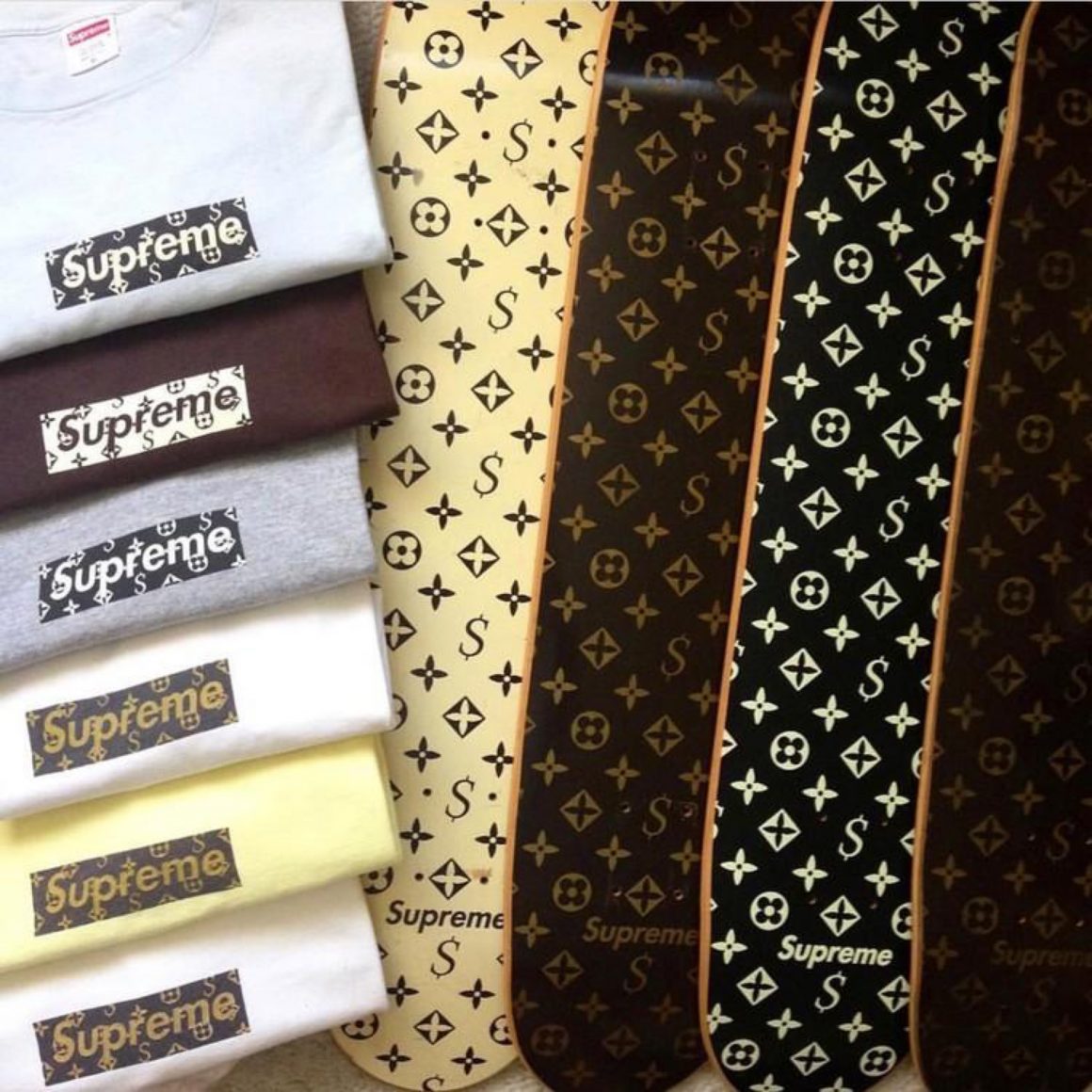
The Enjoy Supreme box logo dropped in 1998 and, again, ripped off Coca-Cola. The familiar combination of red and white used Coca-Cola’s logo to say “Enjoy Supreme”, the first time that the box logo had been redesigned to feature a small Supreme logo. As Supreme was still small enough, it could get away with “borrowing” already established logos to put its spin on it. This carried on for a number of years, including the Gucci and Louis Vuitton versions in 2000. However, that was about to change.
Supreme probably didn’t know it at the time, but it was just about to encounter its first lawsuit. After the release of it’s Louis Vuitton inspired box logo, the French fashion house filed a Cease and Desist Order. Louis Vuitton was unhappy with Supreme using its monogram pattern to adorn skate decks and T-shirts. The independent skate store was ordered to recall the decks two weeks after it had shipped them out. Of course, few skaters ever actually returned the boards.
It was for many in the fashion world, the first time that they had even heard of Supreme. Copying one of the most instantly recognisable motifs in the world is, of course, going to get you noticed. Isn’t it ironic that 17 years later the two would release one of the biggest collaboration in fashion history?
Growing Demand
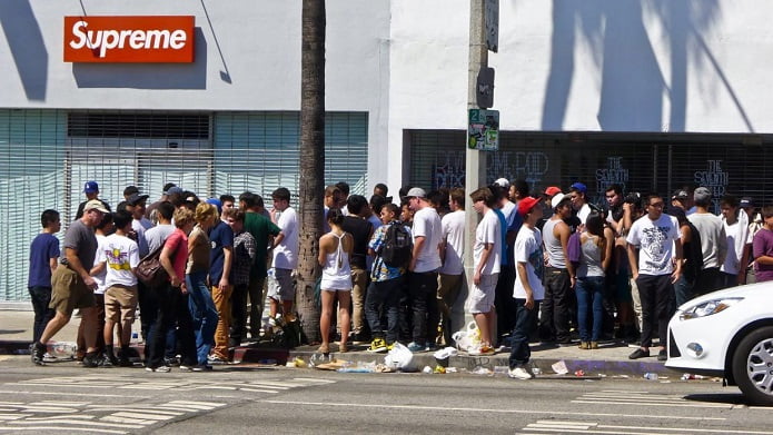
As the box logo started to become a staple in streetwear, Supreme had started to issue more store exclusive versions. Whenever a new Supreme store opened, a special edition box logo opened with it. Harajuku, Daikanyama and Los Angeles had all been issued their own bogos to celebrate, but fans who lived elsewhere were unable to get their hands on them due to their location. Of course, this opened up a brand new secondary market where people could cop on sites like eBay for a considerable markup.
The box logo was now immersed in street culture. It became the calling card, knowing nod and uniform for members of this sub-culture. As the brand grew, so did the hype surrounding its box logo designs. For many, the box logo did and still does epitomise what cool really is. Supreme had begun to issue box logos with the likes of Damien Hirst, Jackson Pollock, Kaws as well as many others. Labels were also now getting involved, including COMME des GARÇONS, Mo Wax and more.
Whilst Supreme may have started out as a humble skate store, it’s box logo design transcended skateboarding altogether. It became something that was worn at fashion weeks and by kids in the street, never escaping its true roots. By the time the official collaboration with Louis Vuitton came about, the box logo was already established as a key piece for anyone in the fashion industry to own.
Final Thoughts
Celebrities like Kanye West, Virgil Abloh, Bella Hadid, Tyler the Creator, Justin Bieber, Kendall Jenner and Travis Scott have all rocked a box logo at some point. The T-shirt has no boundaries, no limitations and no dedicated customer base. Its greatness lies in its simplicity. Above all, however, the box logo defines how less is more. Yes, Supreme may put crazy patterns or have store exclusives. But that doesn’t take away from the original idea.
